Tips on How to Design a Professional Website
A website cannot be successful with just a pretty design and useful content. It should have a style that is user-friendly and functional for all its viewers. There are certain ground rules to follow while you design a professional website designers. Here are the five top tips that will help you achieve this easily.
- Design a clutter free minimalistic homepage
Users do not read each and everything on a website. Instead they quickly scan through. The less they look at, easier will it be to read the content, click on essential links and evaluate. It makes the call to action easy for the user. Break up large headings into sub headings and small paragraphs. Use icons to communicate your point quickly. Keep the images less, bold and simple to look at.
- Follow visual hierarchy when you design each page
It is important to arrange the content in a website effectively which is a web designer’s role. Establish clear visual hierarchy so that readers can read all content at ease. Color, size, contrast, spacing should be mindfully designed. Make each of them intentional. Organize all the content as clear elements with a visual appeal.
- Create crisp easy to read content
Make it easy for users to read and recognize words and sentences. Make it highly readable which is relatively easy. Keep a good contrast between the text and background images. Use careful dark colors, 16pt text size, readable font and style. Sans serif are easy to read on eyes. Use a harmonious effect with uniform font throughout the page, not more than two fonts.
- Create easy navigation throughout the website
Visitors should not lose patience while looking at your web site design while searching for something. Give a solid navigation that takes them easily to the respective web page. Give homepage link to the logo. Keep the menu on top of the website for easy navigation. If you have a long scrolling menu type, use anchor menu. Keep all the important links on the footer too. It can have the social icons, FAQs, contact, blog link, terms of use, etc.
- Make it mobile friendly
Mobile is the most used device for all human needs nowadays. Do not miss to create a responsive and mobile friendly version for your website. Test each page after it is developed in all possible devices available and check for user actions and buttons. Follow mobile friendly website best practices.

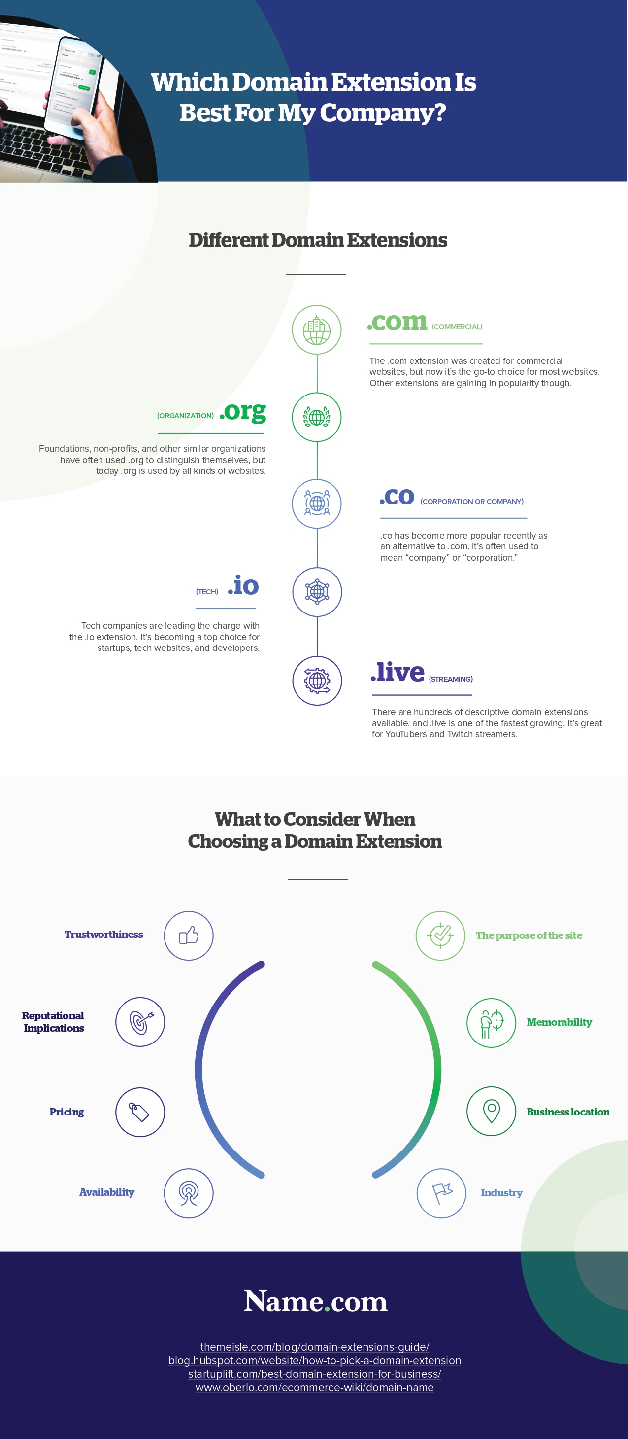
Infographic Created By Name.com, Industry-Leading Website Builder


